This past school year, I began playing the NYT Mini crossword with some friends.
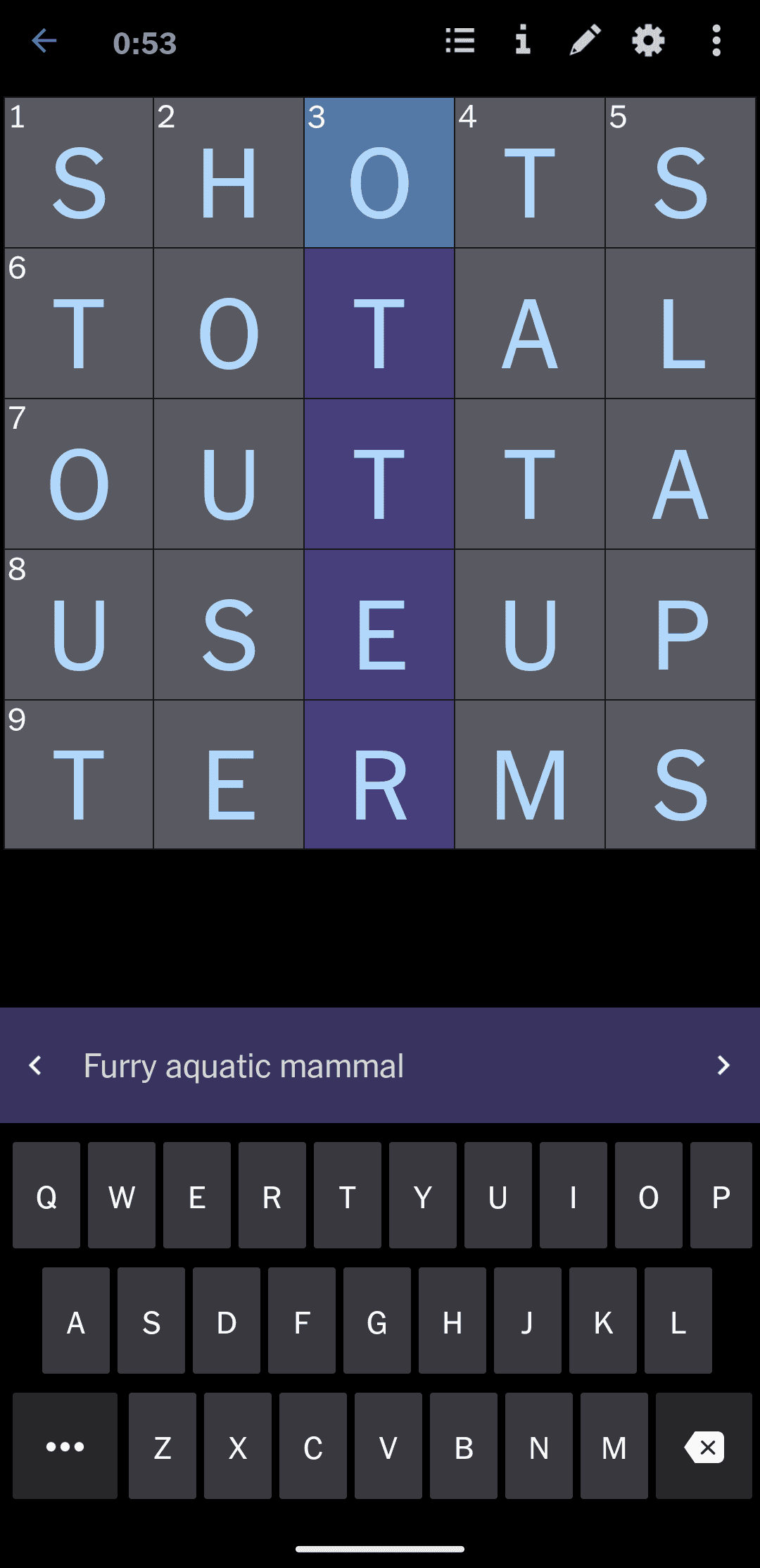
For those unfamiliar, The Mini is a 5x5 daily crossword by NYT that looks like this:

Collecting the Data
I thought it would be interesting to collect the time it took everyone to complete each daily mini via screenshots and see if I could make some cool visualizations as a result of it.
Here's a diagram of what an example leaderboard looked like and how I converted it to data:

Preliminary Sketches
A simple visualization exercise I've learned this past year in my info viz class is to come up with as many visualizations as you can from one dataset. This can be a great exercise for thinking outside the box for creating innovative vizzes.
To start, I begin with some rough sketches:

Starting with simple graphs helped me get familiar with the type of data I had and how they are commonly visualized. Once I had this stepping stone, it was easier to think about alterations and alternative ways I could visualize.
The Graphs
After sketching, I created each viz using D3 (and the basic graphs using recharts):
Basic Graphs
I first tried making the most basic linechart using Recharts, and the result looks... messy.
Daily Completion Time Per User
Side note: it turns out recharts is actually rendering all missing values as 0.
Cumulative Completion Time Per User
Recharts' linechart does look a bit better with cumulative stats:
Many of my friends (including myself) played mini less and less throughout the year as our classes got busier. Thus, it could also be interesting to track when we play the mini
Closing Thoughts
In a perfect world, I would've captured every day and I might've also screenshotted the actual crosswords for each day so I could look for relationships between the words/hints and completion time. But I'm human, so I didn't :(
Maybe one day I'll work at NYT and have access to that sort of data...
